

We'll Help Your Brand Stay On Course
We'll Help Your Brand Stay On Course
We'll Help Your Brand Stay On Course
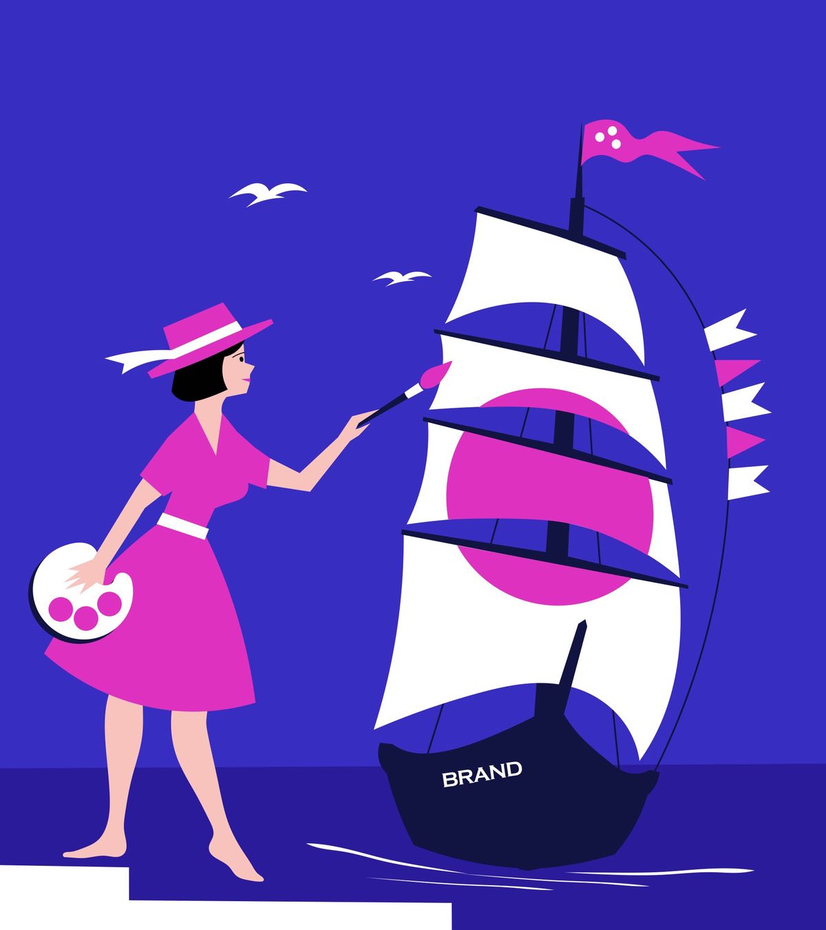
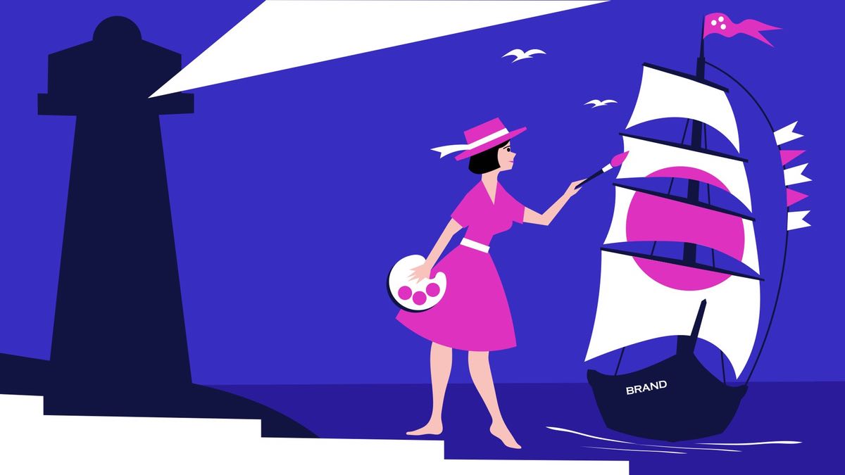
Getting the right result by seeing the brand from the consumer's point of view, just like this young lady in our illustration above.


And to avoid trouble in the ocean of competition
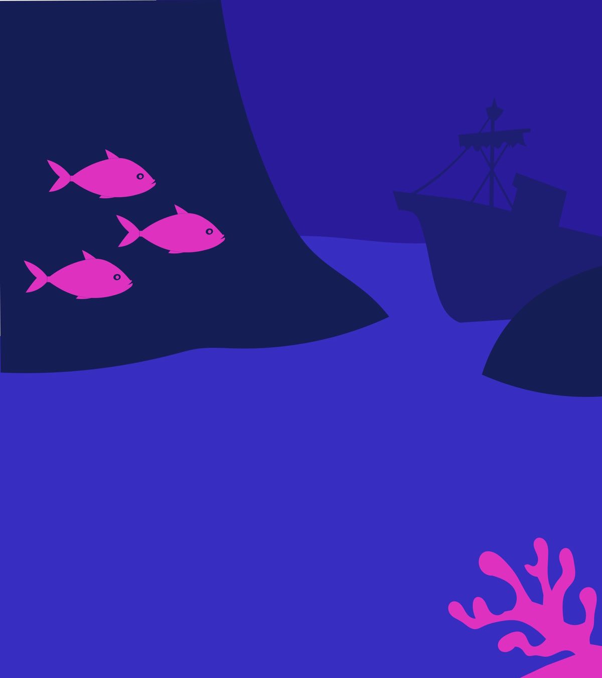
This perspective will allow us to avoid troubles in the ocean of competition.
This perspective will allow us to avoid troubles in the ocean of competition.
This perspective will allow us to avoid troubles in the ocean of competition.


Only Original Knowledge And Experience
Only Original Knowledge And Experience
Original Content
Original Content
We provide our clients with the knowledge and experience that we have accumulated over the years of our work in marketing.



5 Design Elements That Shape Your Brand
5 Design Elements That Shape Your Brand
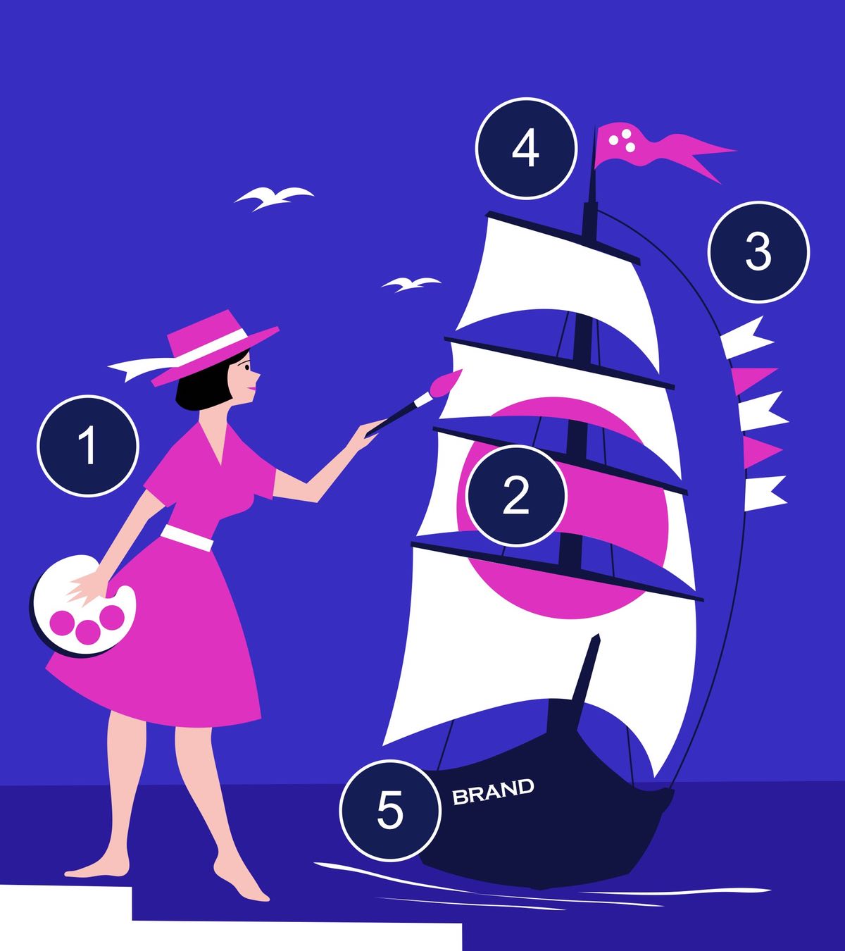
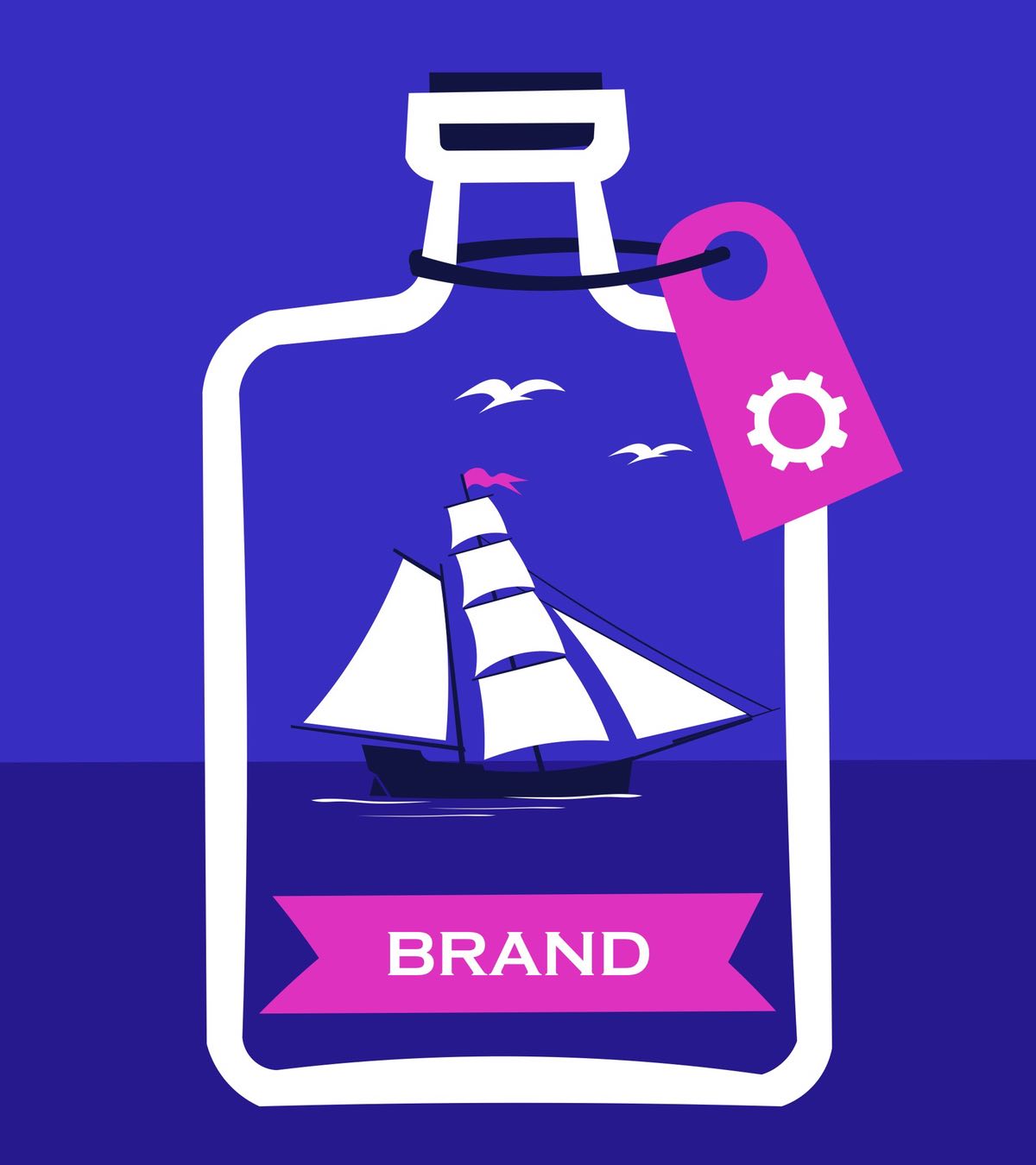
Our image offers a look at the sailboat brand from the customer's point of view. We have depicted five interrelated elements of brand identity that customers consistently pay attention to. The first thing they see is the advertisement (1), then the product appearance (2), the brand promise (3), the logo (4) and the brand name (5).
Our image offers a look at the sailboat brand from the customer's point of view. We have depicted five interrelated elements of brand identity that customers consistently pay attention to. The first thing they see is the advertisement (1), then the product appearance (2), the brand promise (3), the logo (4) and the brand name (5).


No One Likes Advertising
No One Likes Advertising
Given that brand building usually happens in reverse order, from naming to advertising, it's important to make sure you have enough resources and inspiration to create ads. Since no one likes advertising, and it's important for a brand to be liked, you have to try harder. That's why we created a young lady that should catch your attention.
Given that brand building usually happens in reverse order, from naming to advertising, it's important to make sure you have enough resources and inspiration to create ads. Since no one likes advertising, and it's important for a brand to be liked, you have to try harder. That's why we created a young lady that should catch your attention.




The Captain Can't See The Ship From The Deck
The Captain Can't See The Ship From The Deck
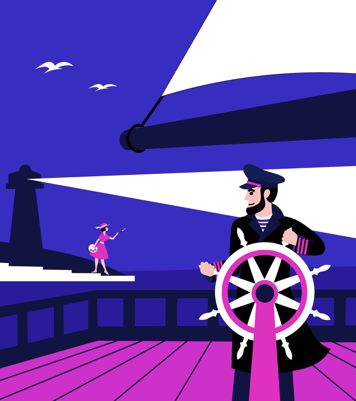
The captain can't see the ship from the deck and that's a problem. If you don't look in the mirror, it's hard to look good. So looking at the brand from the outside is critical to notice if some elements don't harmonize with each other, aren't good enough, or aren't there at all because they weren't even created.
The captain can't see the ship from the deck and that's a problem. If you don't look in the mirror, it's hard to look good. So looking at the brand from the outside is critical to notice if some elements don't harmonize with each other, aren't good enough, or aren't there at all because they weren't even created.


Show Product Appearance
Show Product Appearance
Your logo is not the main element of your brand. It's more important to the customer what they are buying looks like. If you're selling a service, you'll have a hard time figuring out what to show the customer. There is no one-size-fits-all recipe. The solution will depend on the product. We have the necessary experience and examples of how even great companies get it wrong about what their product is.
Your logo is not the main element of your brand. It's more important to the customer what they are buying looks like. If you're selling a service, you'll have a hard time figuring out what to show the customer. There is no one-size-fits-all recipe. The solution will depend on the product. We have the necessary experience and examples of how even great companies get it wrong about what their product is.


Our Branding Insights
Our Branding Insights


We Will Bring You To The Consumer Bay...
We Will Bring You To The Consumer Bay...
Nardans is a one-man crew branding studio. But the good news is that it's part of something much bigger. Nardans is one of four service brands of the strategic marketing company Mark Braus (since 2005). These four brands represent the Bureau of Strategy, Bureau of Products, Bureau of Brands and Bureau of Sales. We provide our clients with the knowledge and experience that we have accumulated over the years of our work in marketing. There are always things on the client side that we have no influence on. This is the quality of the product itself and its price.
Nardans is a one-man crew branding production. But the good news is that it's part of something much bigger. Nardans is one of four service brands of the marketing company Mark Braus (since 2005). These four brands represent the Product Bureau, the Brand Bureau, the Sales Bureau and the Strategy Bureau, in case strategy is needed.



We provide our clients with the knowledge and experience that we have accumulated over the years of our work in marketing. There are always things on the client side that we have no influence on. This is the quality of the product itself and its price.


We're Targeting Service Providers…
We're Targeting Service Providers…
We specialize mainly in service providers because we believe that people mastered goods branding long before marketers were born, and there is nothing difficult about it. We support service providers because we know firsthand how difficult it is for them to sell their sometimes invisible product without a strong brand. It is often difficult for service consumers to imagine what exactly they are paying for and what they will ultimately receive. They don't want long explanations because they have often been deceived. Consumers of services are not going to become professionals in someone else's business for the sake of a one-time transaction. They don't want to feel the pain of disappointment even more than losing money. Service companies do not have large advertising budgets, so they are not of interest to advertising agencies. Customer recommendations go to strong brands. No matter what value a service company creates, it will be ignored until the company adds a strong brand to that value.


We focus on service providers, but we certainly won't turn you down if you decide to knock a well-known goods brand off its pedestal.


We focus on service providers, but we certainly won't turn you down if you decide to knock a well-known goods brand off its pedestal.


Sectors and Industries We Serve
Sectors and Industries We Serve


PROFESSIONAL
SERVICESPROFESSIONAL
SERVICES
FINANCIAL
SERVICESFINANCIAL
SERVICES
HEALTHCARE SERVICES
HEALTHCARE SERVICES

INDUSTRIAL
SECTORINDUSTRIAL
SECTOR
RETAIL AND
HORECARETAIL AND
HORECA
CONSUMERS
GOODSCONSUMERS
GOODS
REAL ESTATE
REAL ESTATE

IT
SECTORIT
SECTOR
LEISURE AND
RESORTSLEISURE AND
RESORTS
MEDIA AND
ENTERTAINMENTMEDIA AND
ENTERTAINMENT

PROFESSIONAL
SERVICESPROFESSIONAL
SERVICES
FINANCIAL
SERVICESFINANCIAL
SERVICES
HEALTHCARE SERVICES
HEALTHCARE SERVICES

INDUSTRIAL
SECTORINDUSTRIAL
SECTOR
RETAIL AND
HORECARETAIL AND
HORECA
CONSUMERS
GOODSCONSUMERS
GOODS
REAL ESTATE
REAL ESTATE

IT
SECTORIT
SECTOR
LEISURE AND
RESORTSLEISURE AND
RESORTS
MEDIA AND
ENTERTAINMENTMEDIA AND
ENTERTAINMENT


Your brand should look like a million dollars
Your brand should look like a million dollars
Brands are the alpha and omega of marketing. Everything starts and ends with them. They often live longer than humans. Whereas the life of the most outstanding advertising is fleeting like the life of a butterfly. In difficult times, your brand may be the only thing you have left to keep you afloat. Stamps are exactly what increases in value over time along with your success and can sometimes cost more than all other corporate property. And since this is possible, we believe that your brand should look like a million dollars.


We consider creating a first impression a top priority. Therefore, we do not stop improving them until we hit the glass ceiling.
We consider creating a first impression a top priority. We understand how important it is that your brand or logo is liked by customers at first sight and they immediately feel that they want to do business with you. Therefore, we do not stop improving them until we hit the glass ceiling.


We Will Beautifully “Dress” Your Brand To Match Where You Are Going
We Will Beautifully “Dress” Your Brand To Match Where You Are Going
We Will Beautifully “Dress” Your Brand To Match Where You Are Going
We Will Beautifully “Dress” Your Brand To Match Where You Are Going





Brand naming for businesses
Brand naming for businesses


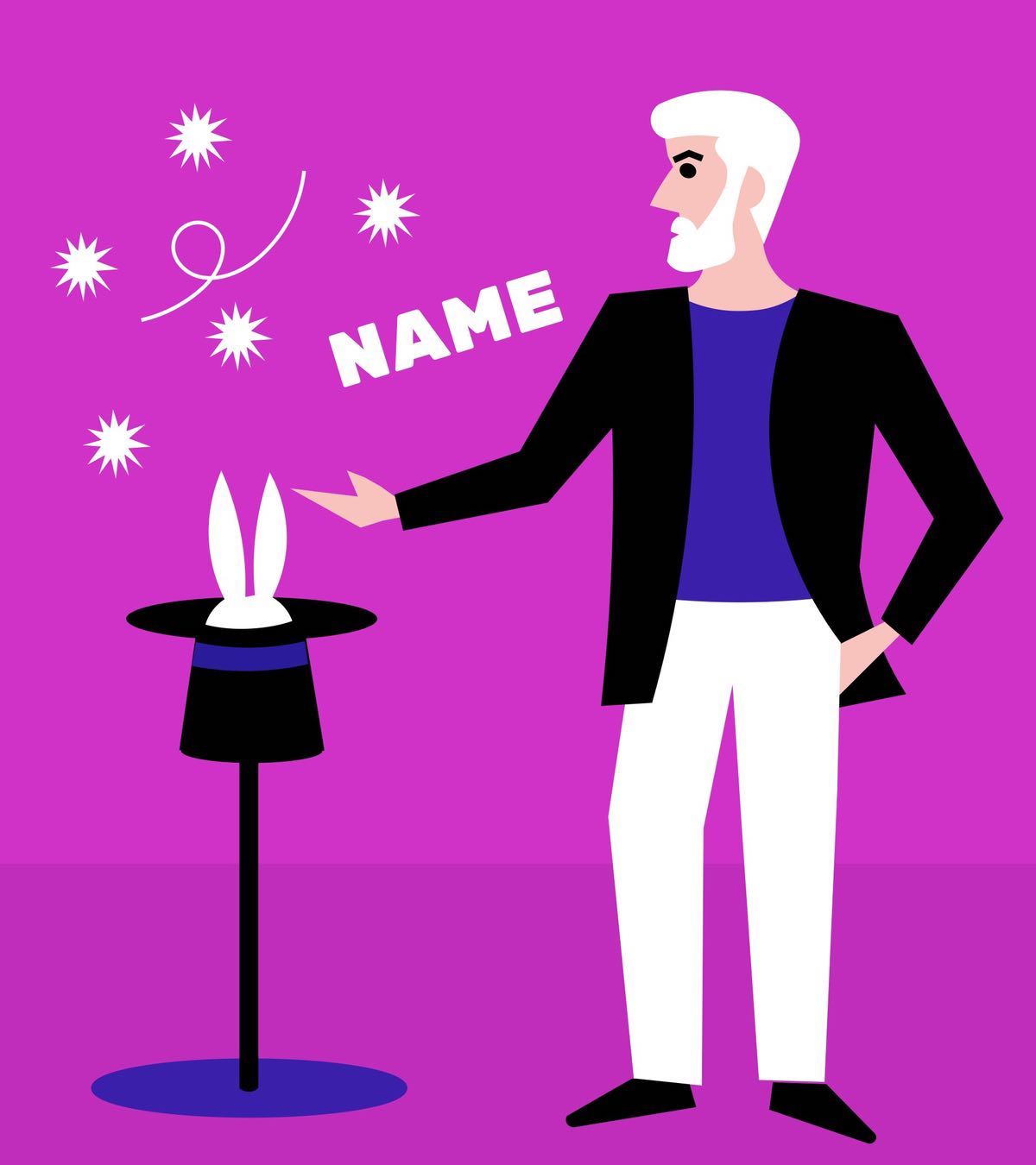


Brand naming for businesses


Logos and trade marks design
Logos and trade marks design
Logos and trade marks design


Product appearance design
Product appearance design


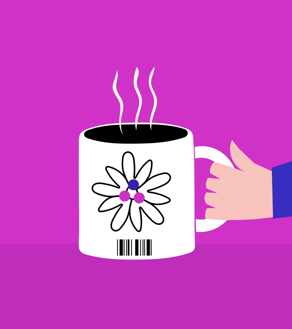


Design for product developers


Information Design for Branding
Information Design for Branding
Information Design for Branding


Advertising materials for promotions
Advertising materials for promotions


Advertising materials for promotions

Dowloag Prices (PDF)


Browse our work to quickly assess how good it is for you.
Browse our work to quickly assess how good it is for you.


Browse our work to quickly assess how good it is for you.





Check out my work



Check out my work
Check out my work


Corporate & Products Names
Corporate & Products Names


Corporate And Product Names

Eletur
Vartas
Unicampus
Unica
Q3
Potihenku
Elfy
Iglas
Resorter
Elewind
Lman
Victoria Workers
Empower
Aquado
Markstyle
Gribus
Mark Braus
PSPC
Hanna Braus
V.V.V. Group
Foras
Reinvestor
Green Bar
Mary Max
Autohansa
Eletur
Vartas
Resorter
Unica
Q3
Elfy
Potihenku
Empower
Iglas
Aquado
Markstyle
Elewind
Lman
Mark Braus
Victoria Workers
Setka
V.V.V. Group
Foras
Reinvestor
Green Bar
Gribus
Mary Max
PSPC
Hanna Braus
Eletur
Vartas
Resorter
Q3
Elfy
Potihenku
Empower
Iglas
Aquado
Markstyle
Elewind
Lman
Mark Braus
Victoria Workers
Setka
V.V.V. Group
Foras
Reinvestor
Green Bar
Gribus
Mary Max
Unica
PSPC
Hanna Braus
Braus


Inous
Farm Practice
West Practice
West
Digifarm
Silenco
Magfriend
Vinconta
Strato
Ravelin
Billy Man
Funny Bunny
Setka
Super Seven
Fingers Club
Alitus
World in Red
Fishpublic
Camermag
Sportpark
AR7
H2O
Dumka.TV
Bereg School
Inous
Ravelin
West
Digifarm
Billy Man
Strato
Silenco
Vinconta
Super Seven
Fingers Club
West Practice
Farm Practice
World in Red
Funny Bunny
Fishpublic
Bereg School
Magfriend
Autohansa
Camermag
Sportpark
AR7
H2O
Dumka.TV
Alitus
Ravelin
West
Silenco
Inous
Strato
Digifarm
AR7
H2O
Alitus








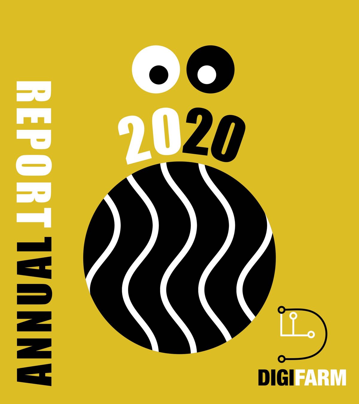
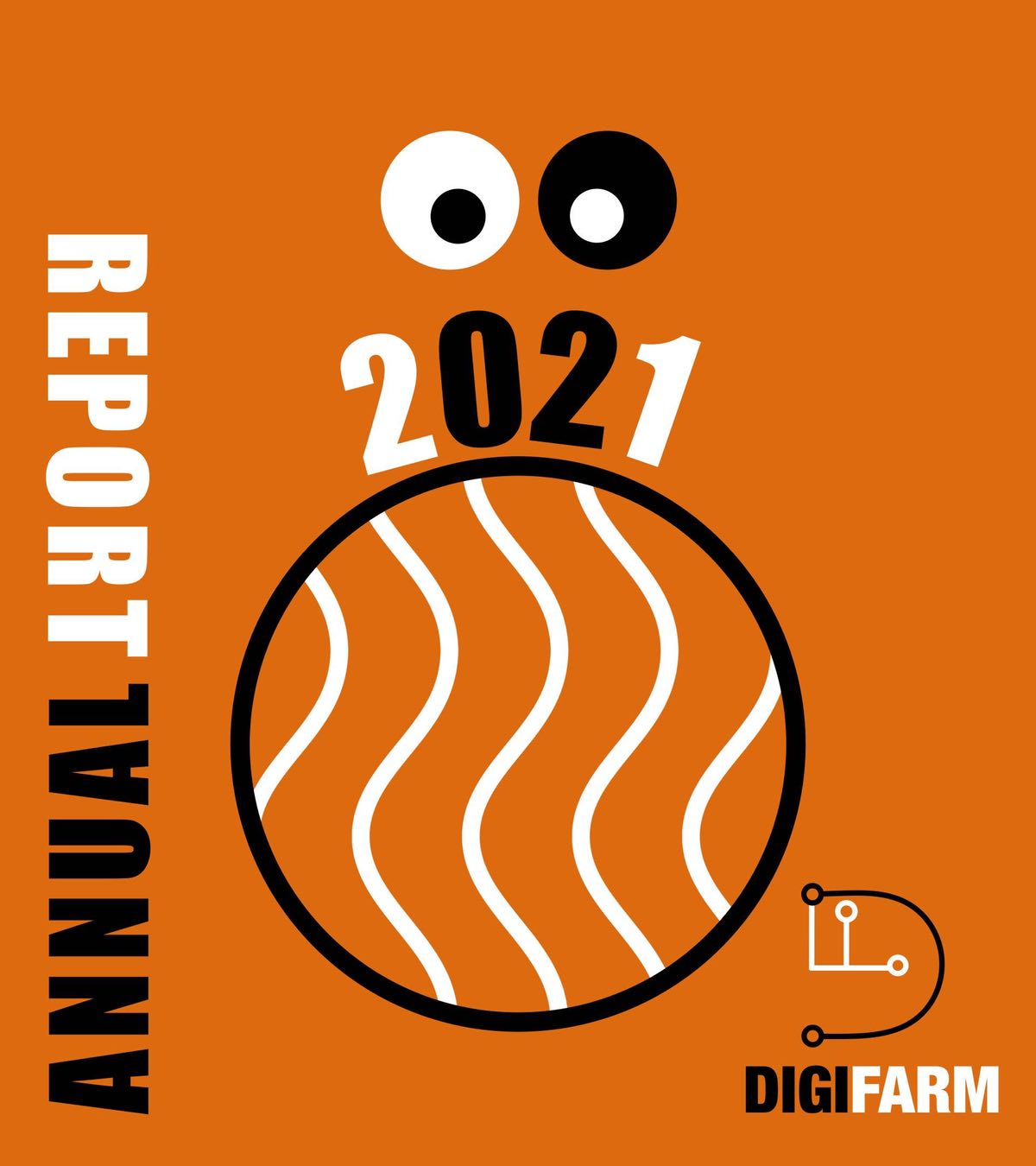
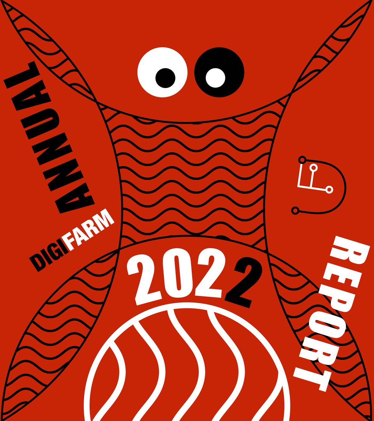
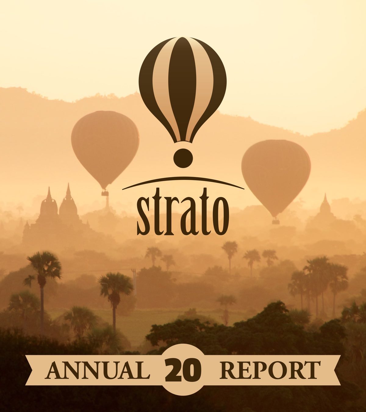
Brochures and Reports
Brochures and Reports




Banners & Landing Pages
Banners & Landing Pages










Creative Ads Posters
Creative Ads Posters




Our Advertising -)
Our Advertising -)


We Offer Three Branding Packs
We Offer Three Branding Packs


FOR STARTUP

FOR STARTUP

FOR STARTUP


Everything you need for your launch in one package. Nothing extra. The main principle is that less is better. Name, logo, product packaging, website, pitch deck presentation and poster.
Everything you need for your launch in one package. Nothing extra. The main principle is that less is better. Name, logo, product packaging, website, pitch deck presentation and poster.


FOR SCALEUP

FOR SCALEUP

FOR SCALEUP


For those who have successfully launched a startup, have a sought-after product and loyal customers, we offer a comprehensive solution for sales growth. Rebranding (renovation, minor amendments or deep changes if necessary), selling website, social media, promotional materials.
For those who have successfully launched a startup, have a sought-after product and loyal customers, we offer a comprehensive solution for sales growth. Rebranding (complete renovation, minor amendments or deep changes if necessary), selling website, social media, promotional materials.


FOR EXPANCE

FOR EXPANCE

FOR EXPANCE


For the big guys who plan to enter new markets we offer an adaptation. Re-branding (improvements or deep changes), a product look and website adapted for the target market, as well as adapted social media and promotional materials. We have experience in the USA, Belgium, Bulgaria, Czech Republic, Iceland, Finland, Germany, Latvia, Lithuania, Malta, Portugal, Poland, Spain.
For the big guys who plan to enter new markets we offer a complete internationalization solution. Re-branding (complete refresh, minor improvements or deep changes if necessary), a product look and website adapted for the target market, as well as adapted social media and promotional materials.


Each basic package can be extended depending on your individual needs and industry specifics. We will prepare a customized proposal for you with examples and prices.
Each basic package can be extended depending on your individual needs and industry specifics. We will prepare a customized proposal for you with examples and prices.


Recruiting Company Rebranding
Recruiting Company Rebranding
View our case studies to get a picture of working with Nardans.
View this case study to get a picture of working with Nardans
An example of two-way marketing.
(Scale Up Stage)
(Scale Up Stage)

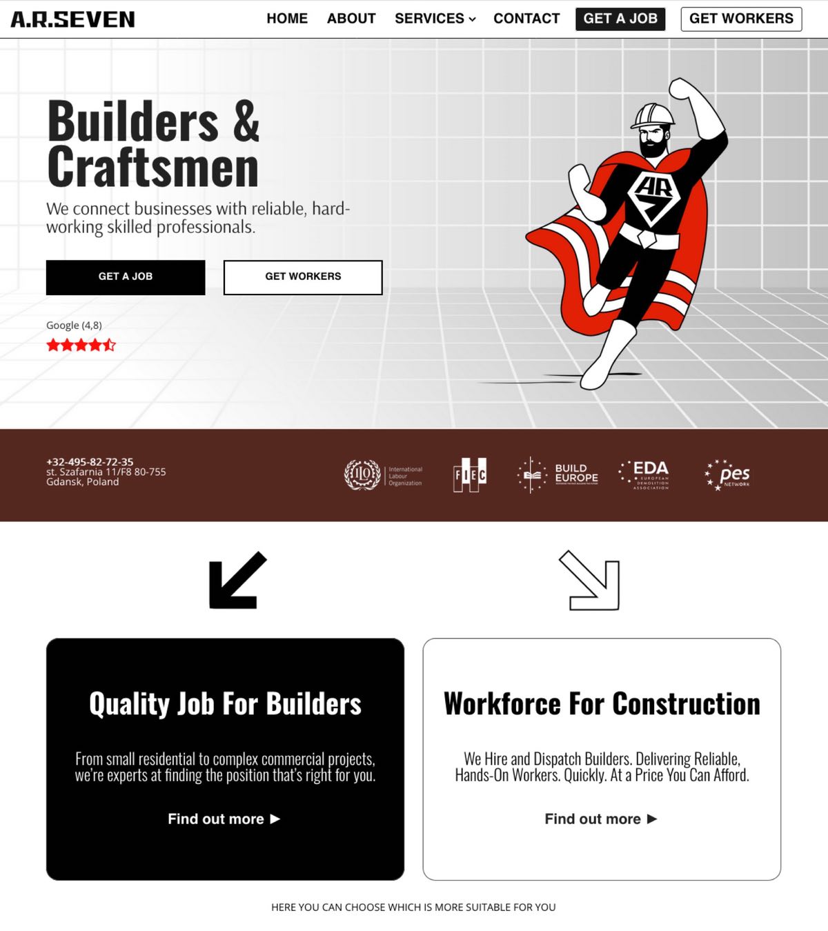
HR7 is not an agency-type recruiting company. They are a leading dispatch of pre-assembled work crews to construction sites. Starting small and moving on if successful is a smart way to build up a cooperation. As in most of our cases, the project began only with a request to create a logo. It was a great customer and we tried very hard. As a result, we created all five main elements of brand identification combined into a single whole. Name, logo, product visualization, brand promise (website) and advertising image.
HR7 is not an agency-type recruiting company. They are a leading dispatch of pre-assembled work crews to construction sites. Starting small and moving on if successful is a smart way to build up a cooperation. As in most of our cases, the project began only with a request to create a logo. It was a great customer and we tried very hard. As a result, we created all five main elements of brand identification combined into a single whole. Name, logo, product visualization, brand promise (website) and advertising image.
HR7 is a recruiting company from Poland. It sends pre-hired work crews to construction sites as a subcontractor. It is difficult for us to accurately determine the stage of development of the company's business. The company has not yet managed to grow in the domestic market but has already been able to achieve success abroad.
HR7 is a recruiting company from Poland. It sends pre-hired work crews to construction sites as a subcontractor. It is difficult for us to accurately determine the stage of development of the company's business. The company has not yet managed to grow in the domestic market but has already been able to achieve success abroad.


Starting small and moving on if successful is a smart way to build up a cooperation. As in most of our cases, the project began only with a request to create a logo. It was a great customer and we tried very hard. As a result, we created all five main elements of brand identification combined into a single whole. Name, logo, product visualization, brand promise (website) and advertising image.
Starting small and moving on if successful is a smart way to build up a cooperation. As in most of our cases, the project began only with a request to create a logo. It was a great customer and we tried very hard. As a result, we created all five main elements of brand identification combined into a single whole. Name, logo, product visualization, brand promise (website) and advertising image.


BRAND NAME
BRAND NAME

We started by creating a logo for HR7 because the company insisted on keeping the name. During our work, we found out that the name HR7 turned out to be extremely popular among HR specialists, and we discovered several companies with a similar name in Poland and Germany. This did not give a chance to build a strong brand, and it simply confused customers when searching online. Taking into account the already developed and approved idea for the HR7 logo, and the fact that the company by this time already had contracts with several regular clients in Western Europe, we proposed a successor name very similar to the old one - AR7.
We started by creating a logo for HR7 because the company insisted on keeping the name. During our work, we found out that the name HR7 turned out to be extremely popular among HR specialists, and we discovered several companies with a similar name in Poland and Germany. This did not give a chance to build a strong brand, and it simply confused customers when searching online. Taking into account the already developed and approved idea for the HR7 logo, and the fact that the company by this time already had contracts with several regular clients in Western Europe, we proposed a successor name very similar to the old one - AR7.

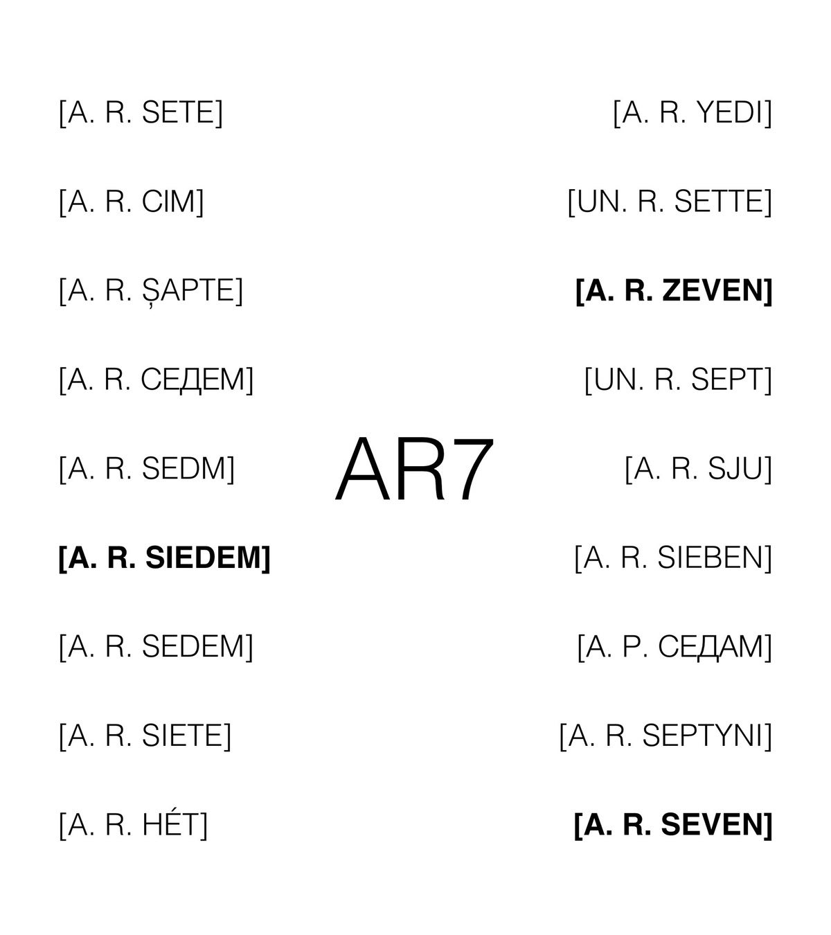


It looked better and even sounded better in European languages. And most importantly, it did not require translation. For the text name, we suggested "a.r.seven", which allowed us to create a text logo in addition to the AR7 brand.
It looked better and even sounded better in European languages. And most importantly, it did not require translation. For the text name, we suggested "a.r.seven", which allowed us to create a text logo in addition to the AR7 brand.


BRAND LOGO AND MARK
BRAND LOGO AND MARK

The symmetrical heraldic emblem was an important element of the brand strategy, because from the very beginning the company intended to use it on work uniforms. The emblem had to look so that it would appeal to a worker of any age, and he would be proud to wear it not only at work. It was clear that construction workers had never belonged to the aristocracy, so no crests. No small details to make everything clearly visible from afar. An emblem with an inscription didn't work for us. An inscription with the name of a little-known recruiting company consisting of two letters and a number would not make the builders proud, and we needed the workers to be proud of themselves. We thought of the elite military and suggested a chevron-shaped emblem. It looked like a shield. This resemblance immediately gave us advertising ideas, which we will talk about in more detail in the advertising section.
The symmetrical heraldic emblem was an important element of the brand strategy, because from the very beginning the company intended to use it on work uniforms. The emblem had to look so that it would appeal to a worker of any age, and he would be proud to wear it not only at work. It was clear that construction workers had never belonged to the aristocracy, so no crests. No small details to make everything clearly visible from afar. An emblem with an inscription didn't work for us. An inscription with the name of a little-known recruiting company consisting of two letters and a number would not make the builders proud, and we needed the workers to be proud of themselves. We thought of the elite military and suggested a chevron-shaped emblem. It looked like a shield. This resemblance immediately gave us advertising ideas, which we will talk about in more detail in the advertising section.

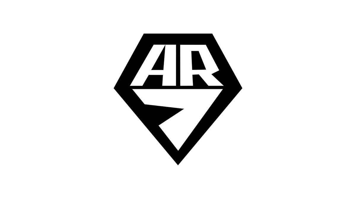

For the website and not only we made a text logo in which we put dots to separate the characters and wrote our number 7 in words. We proceeded from the fact that if the emblem in the form of a shield is positioned by us as a special mark, it should be used as a trademark. For documents and other corporate needs, a text logo is better suited. This approach allowed us to somewhat separate the AR7 mark from the company itself and as if to make it the owners of those who wear it on themselves. We were sure that proudly wearing a corporate name on the chest outside of work will be few willing - it is quite another matter if it is a stylish special sign.
For the website and not only we made a text logo in which we put dots to separate the characters and wrote our number 7 in words. We proceeded from the fact that if the emblem in the form of a shield is positioned by us as a special mark, it should be used as a trademark. For documents and other corporate needs, a text logo is better suited. This approach allowed us to somewhat separate the AR7 mark from the company itself and as if to make it the owners of those who wear it on themselves. We were sure that proudly wearing a corporate name on the chest outside of work will be few willing - it is quite another matter if it is a stylish special sign.


PRODUCT VISUALISATION
PRODUCT APPEARANCE
PRODUCT VISUALISATION
PRODUCT APPEARANCE

The AR7 recruiting company's product is а construction worker, so its appearance should act as an attractive package for the product that customers buy. Workwear is as important to AR7 as its iconic bottle is to Coca-Cola. The role of AR7 workwear in brand visualization is exactly the same. For the market, an AR7 worker is not the same as a worker who is usually dressed in a uniform by a construction company, because for a construction company, an employee is an internal resource, not a final product. Therefore, the clothing style must be attractive and visually obvious so that it can be instantly identified with the AR7 brand. The style must be such that it can be easily and inexpensively reproduced at any scale if necessary. The style must correspond to the main advertising idea of the Superhero (spoiler alert) and the brand promise, and be such that employees want to follow it without coercion. The uniform must have an easily recognizable distinctive element that can be temporarily used for identification even without the image of the brand symbols. We found such an element of identity for a construction site landscape. Meet Little Red Riding Hood!
The AR7 recruiting company's product is а construction worker, so its appearance should act as an attractive package for the product that customers buy. Workwear is as important to AR7 as its iconic bottle is to Coca-Cola. The role of AR7 workwear in brand visualization is exactly the same. For the market, an AR7 worker is not the same as a worker who is usually dressed in a uniform by a construction company, because for a construction company, an employee is an internal resource, not a final product. Therefore, the clothing style must be attractive and visually obvious so that it can be instantly identified with the AR7 brand. The style must be such that it can be easily and inexpensively reproduced at any scale if necessary. The style must correspond to the main advertising idea of the Superhero (spoiler alert) and the brand promise, and be such that employees want to follow it without coercion. The uniform must have an easily recognizable distinctive element that can be temporarily used for identification even without the image of the brand symbols. We found such an element of identity for a construction site landscape. Meet Little Red Riding Hood!

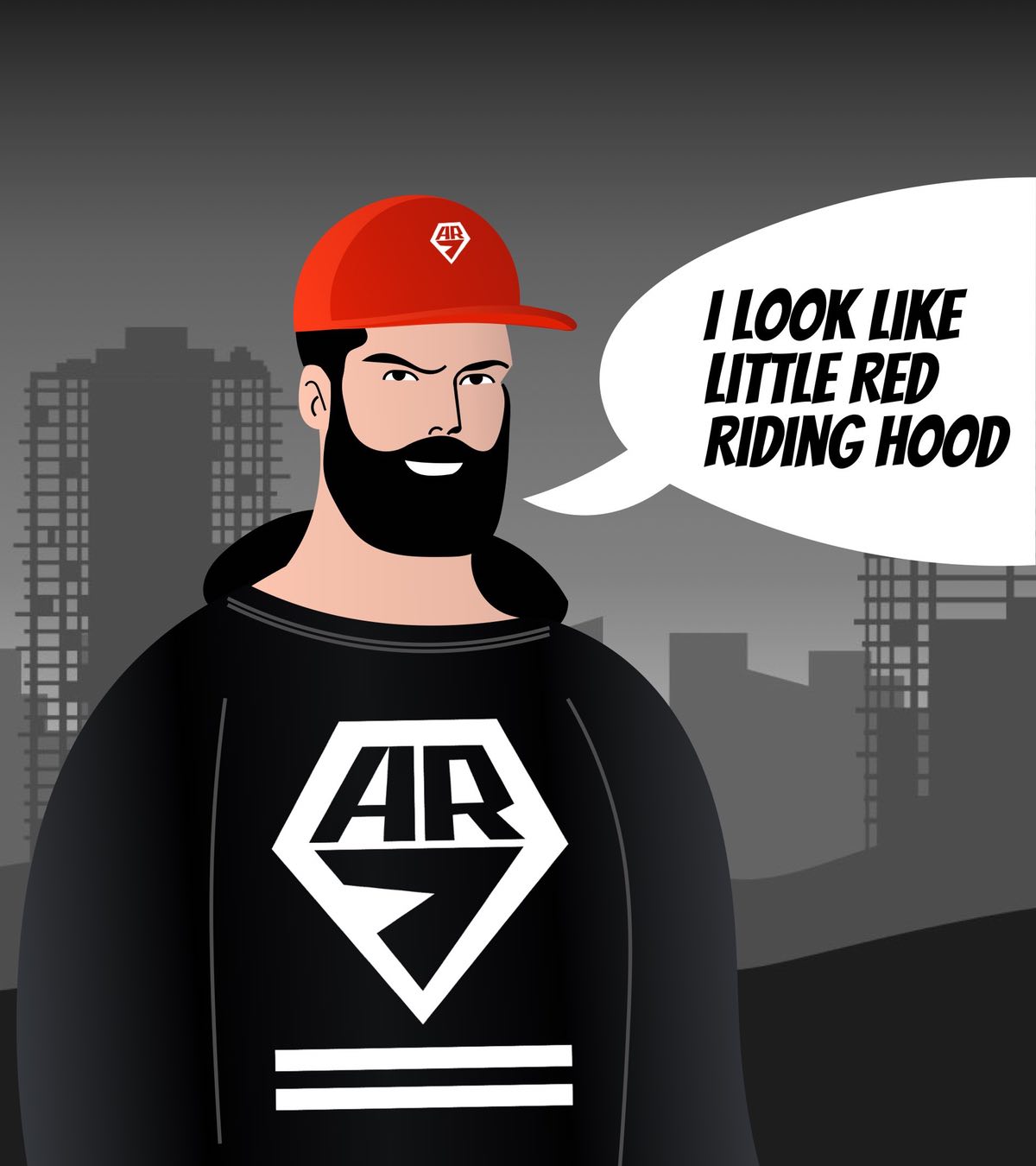

If you read all the way to the end of the case study, you'll find out where those two strange stripes under the AR7 sign come from. Come on, we're not doing this to lure you in. This is not a paper book, if you don't want to wait, just follow this link and read the explanation at the end about these stripes and then you can always come back to the next section.
If you read all the way to the end of the case study, you'll find out where those two strange stripes under the AR7 sign come from. Come on, we're not doing this to lure you in. This is not a paper book, if you don't want to wait, just follow this link and read the explanation at the end about these stripes and then you can always come back to the next section.


BRAND PROMICES (WEBSITE)
BRAND PROMICES (WEBSITE)

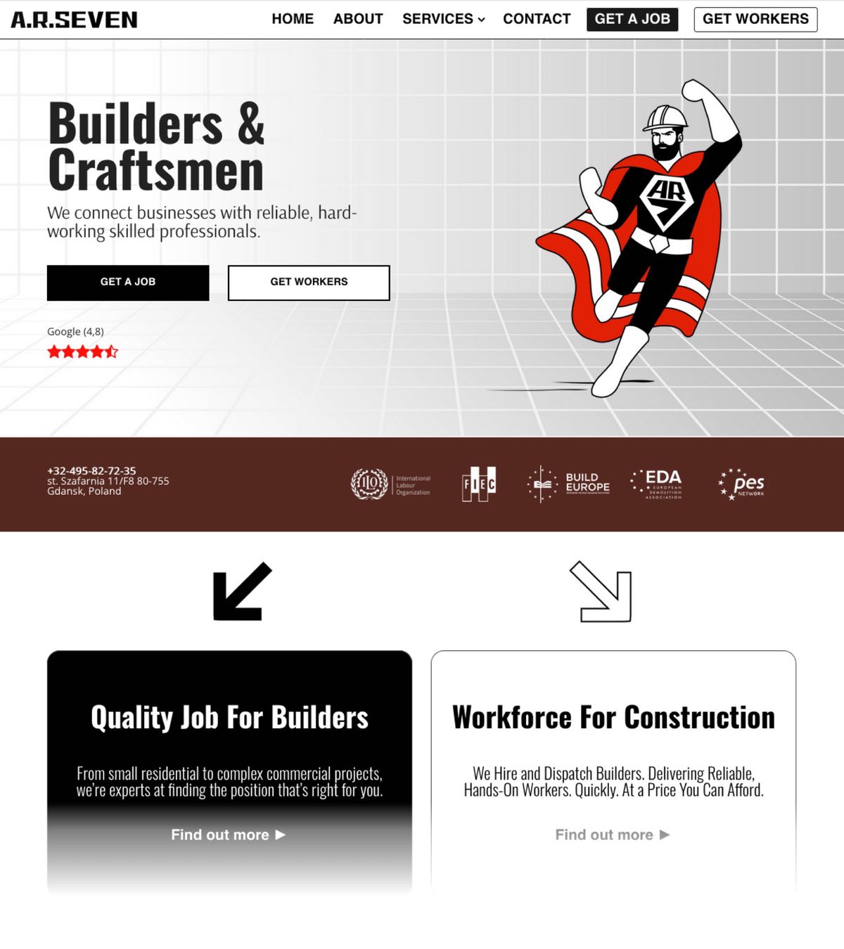


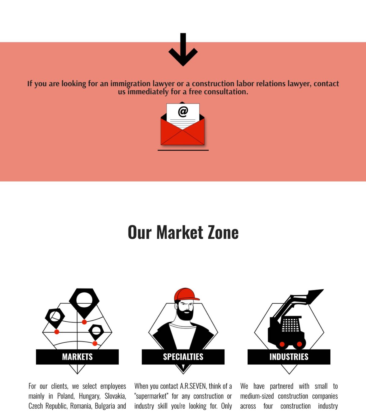
This site is not as simple as it might seem at first glance. We gave it a standard business look to make visitors feel comfortable. But you most likely won’t find something like this among ready-made templates. We created a real agency website for the client. Anyone who works according to the agency principle will understand what the problem is. The agency always conducts two-directional marketing. His clients represent two completely different audiences. You will now understand how different they are. In our example, these are construction workers whom the agency hires and construction companies to which it provides them under contract. On the one hand people, on the other companies. It is difficult to implement two marketing communications for b2c and b2b on one website at the same time. The interests of these groups are opposite, the needs for information and the ways of obtaining it are so different that we were already thinking of persuading the customer to create two separate sites. Some agencies do this. The only thing that kept us from making such a decision was that the interests of the builders and the companies converged in that both sides wanted to clearly understand who they were dealing with and look a little behind the scenes. It is important for workers to see which construction companies they will work for, and companies are interested in how the agency selects applicants. We separated the client flows at the very beginning of the main page, and marked them with different colors. Black for builders and white for companies. The corporate territory of the agency itself is also on a white background. We used a variety of illustrations for both to improve perception and maintain a consistent style.
This site is not as simple as it might seem at first glance. We gave it a standard business look to make visitors feel comfortable. But you most likely won’t find something like this among ready-made templates. We created a real agency website for the client. Anyone who works according to the agency principle will understand what the problem is. The agency always conducts two-directional marketing. His clients represent two completely different audiences. You will now understand how different they are. In our example, these are construction workers whom the agency hires and construction companies to which it provides them under contract. On the one hand people, on the other companies. It is difficult to implement two marketing communications for b2c and b2b on one website at the same time. The interests of these groups are opposite, the needs for information and the ways of obtaining it are so different that we were already thinking of persuading the customer to create two separate sites. Some agencies do this. The only thing that kept us from making such a decision was that the interests of the builders and the companies converged in that both sides wanted to clearly understand who they were dealing with and look a little behind the scenes. It is important for workers to see which construction companies they will work for, and companies are interested in how the agency selects applicants. We separated the client flows at the very beginning of the main page, and marked them with different colors. Black for builders and white for companies. The corporate territory of the agency itself is also on a white background. We used a variety of illustrations for both to improve perception and maintain a consistent style.


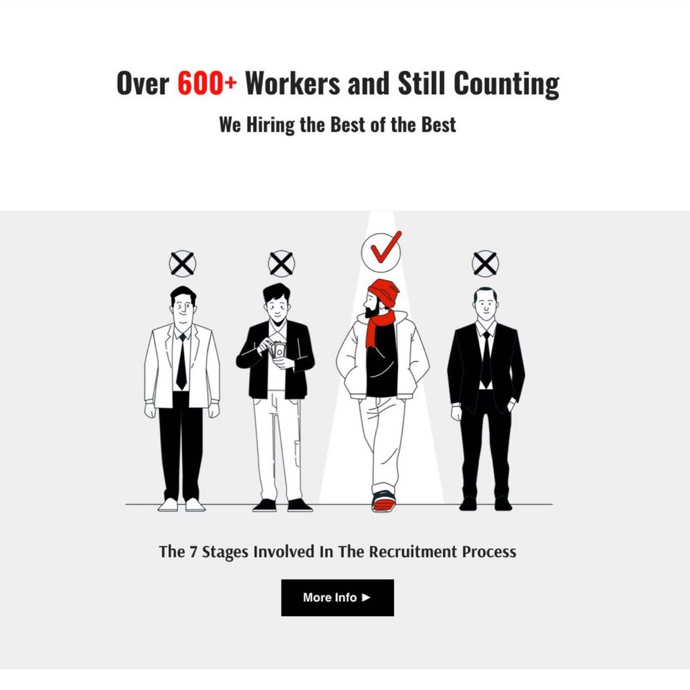

We did not use the drawings for decoration, but as explanations. Dealing with serious people on both sides, we used in the illustrations not the usual doodles, but typical characters. To balance the lighthearted cartoon style and give the agency a serious corporate look, we developed original icons stylized as a corporate logo.
We did not use the drawings for decoration, but as explanations. Dealing with serious people on both sides, we used in the illustrations not the usual doodles, but typical characters. To balance the lighthearted cartoon style and give the agency a serious corporate look, we developed original icons stylized as a corporate logo.
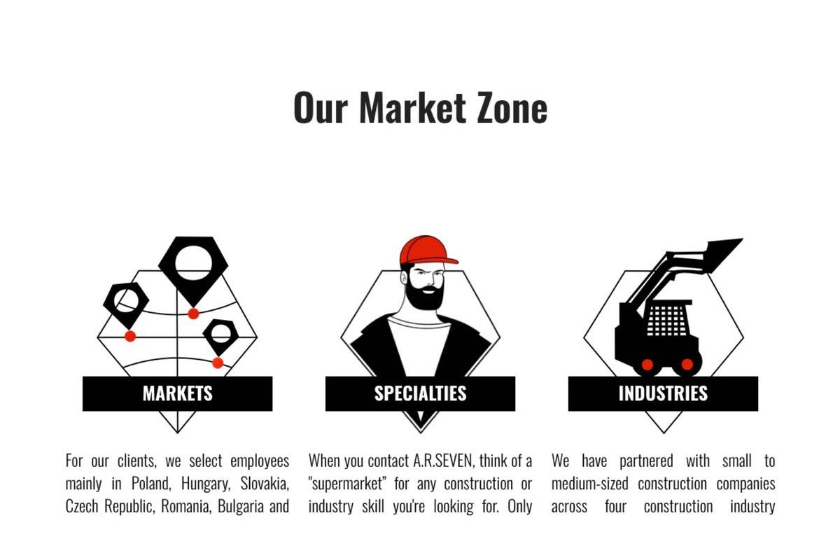

We have prepared texts that convey to customers the brand promises that are important to them. Those are the very promises that the client wants to know about before looking at the company logo and remembering its name. Before getting to the site and finding out what a wonderful company he has to deal with, the client sees an advertisement. We will talk about it further.
We have prepared texts that convey to customers the brand promises that are important to them. Those are the very promises that the client wants to know about before looking at the company logo and remembering its name. Before getting to the site and finding out what a wonderful company he has to deal with, the client sees an advertisement. We will talk about it further.


BRAND ADVERTISING
BRAND ADVERTISING

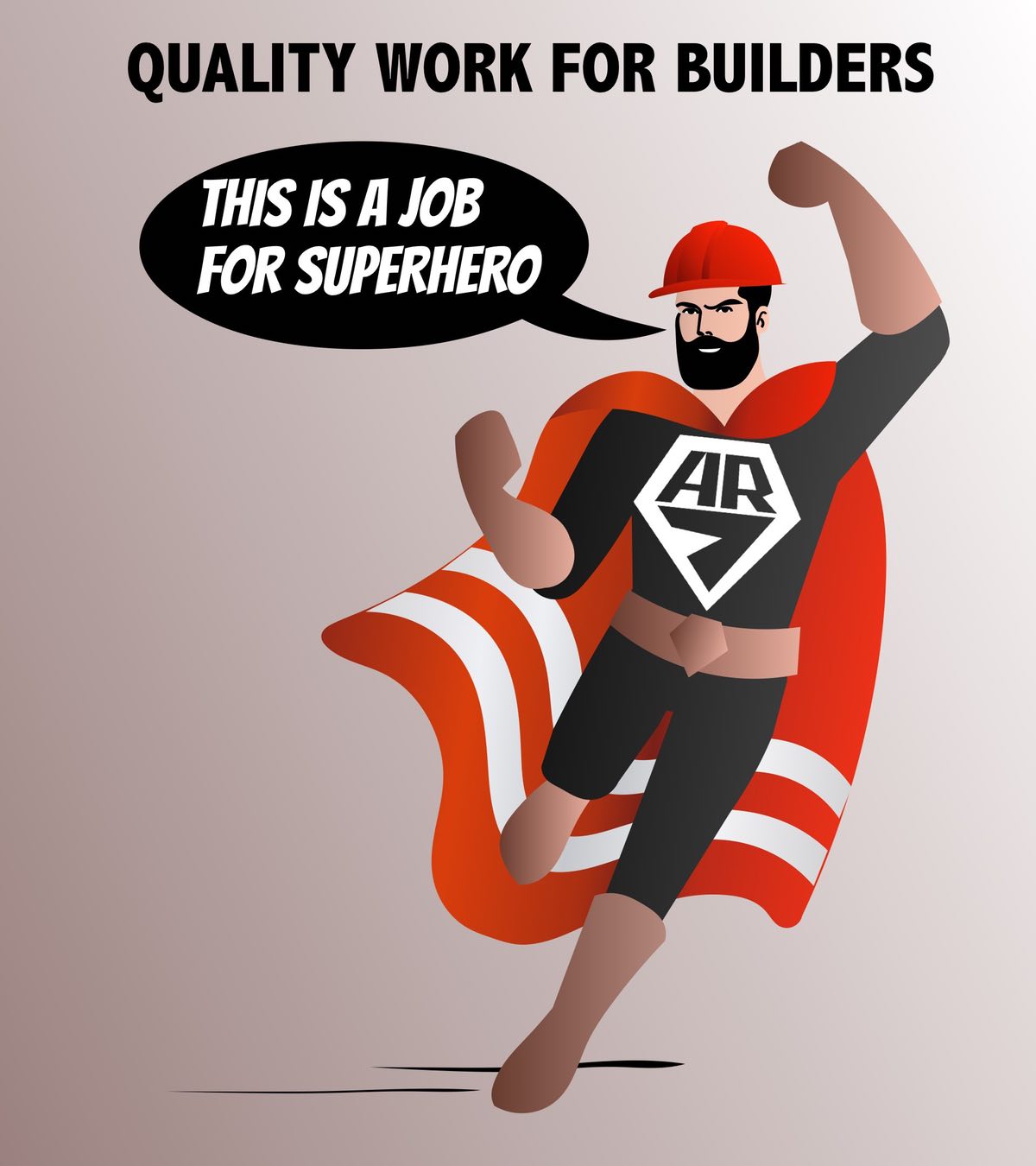
Even though a brand's advertisement is created last, customers will see it first. This will begin their acquaintance with the brand. If your clients are builders from Eastern European countries who do not like advertising, then loving your product will be as difficult for them as loving a stranger. Fortunately, this is not impossible. Our recipe for such a difficult case is simple - you need to show them what they already love. You may have already noticed the builder-superhero on the main page of the AR7 website. This is the very advertising idea that we developed for the service brand so that it could be effectively advertised with minimal budgets. To do this, we adapted a well-known cult character instead of inventing something original.
Even though a brand's advertisement is created last, customers will see it first. This will begin their acquaintance with the brand. If your clients are builders from Eastern European countries who do not like advertising, then loving your product will be as difficult for them as loving a stranger. Fortunately, this is not impossible. Our recipe for such a difficult case is simple - you need to show them what they already love. You may have already noticed the builder-superhero on the main page of the AR7 website. This is the very advertising idea that we developed for the service brand so that it could be effectively advertised with minimal budgets. To do this, we adapted a well-known cult character instead of inventing something original.

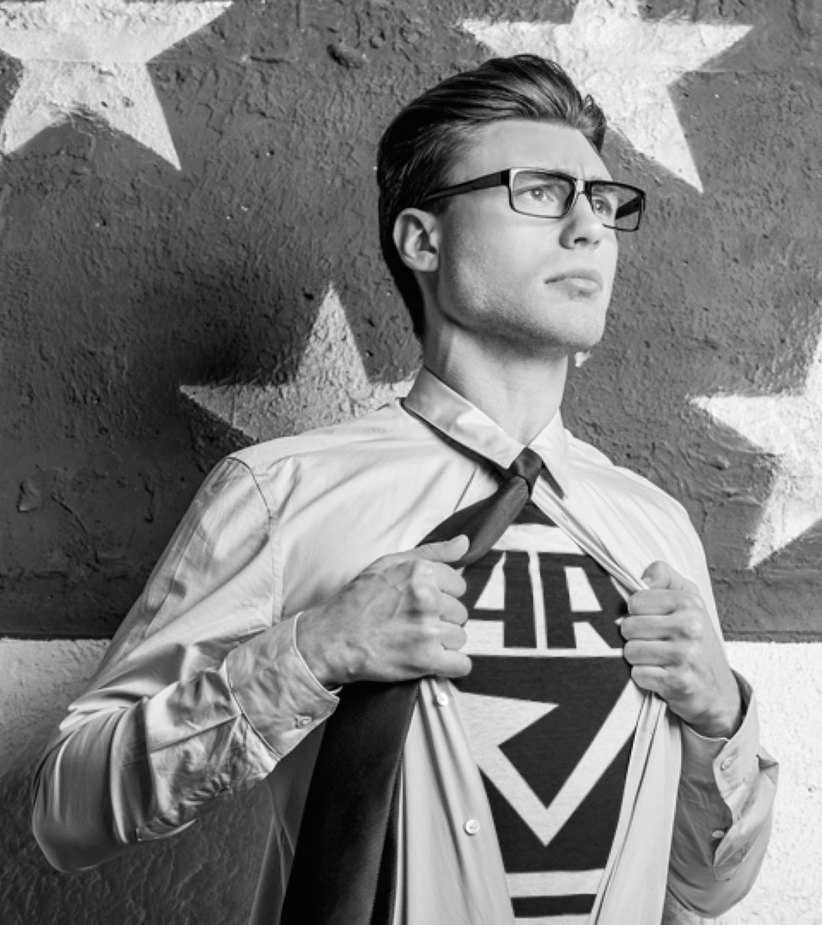

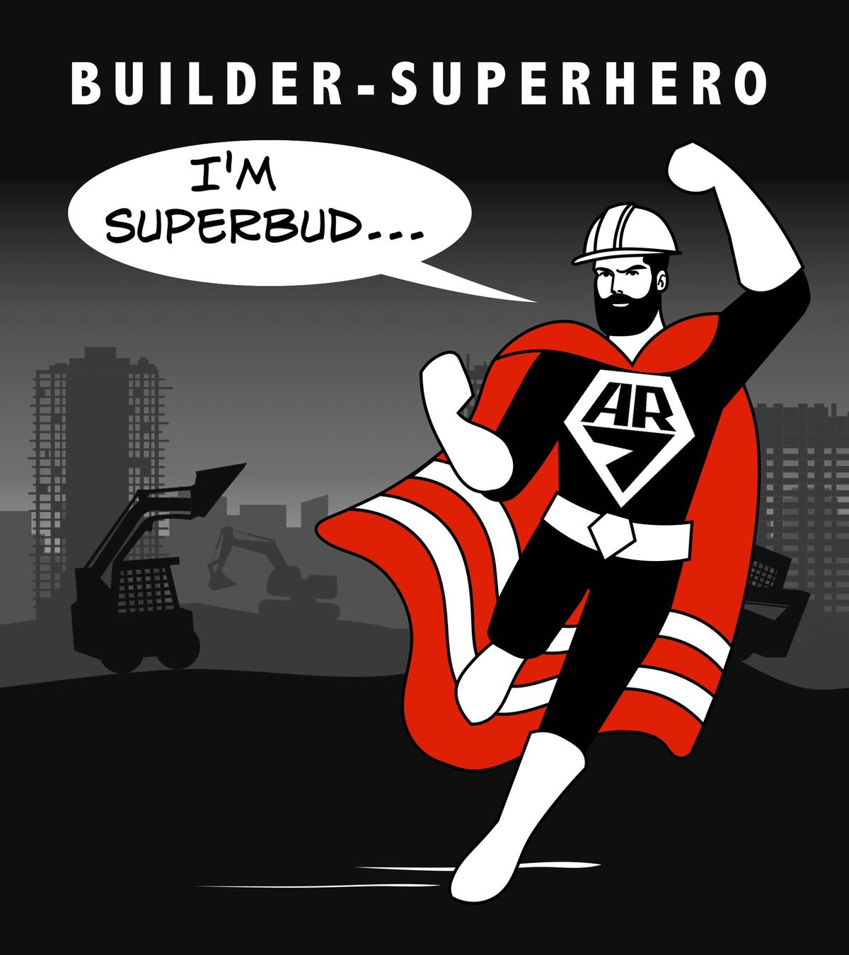

Despite the fact that the recruiting company AR7 cannot compare with large international companies, it still conducts its business by attracting workers from various countries in Eastern Europe and sending them to construction sites in Western Europe. We understood that the costs of familiarizing a wide range of construction workers with original advertising will not pay off until the End of the World, even if this image itself is outstanding, which, however, cannot be guaranteed. If we proceed from the fact that the very fact of familiarizing builders with advertising will not be enough to cause a positive response and start "word of mouth", then it becomes obvious that the only correct decision will be to break into the market "on the shoulders of giants". We proposed the image of a construction worker as a superhero and linked his costume with the construction worker's signature clothing through the trademark on the chest.
Despite the fact that the recruiting company AR7 cannot compare with large international companies, it still conducts its business by attracting workers from various countries in Eastern Europe and sending them to construction sites in Western Europe. We understood that the costs of familiarizing a wide range of construction workers with original advertising will not pay off until the End of the World, even if this image itself is outstanding, which, however, cannot be guaranteed. If we proceed from the fact that the very fact of familiarizing builders with advertising will not be enough to cause a positive response and start "word of mouth", then it becomes obvious that the only correct decision will be to break into the market "on the shoulders of giants". We proposed the image of a construction worker as a superhero and linked his costume with the construction worker's signature clothing through the trademark on the chest.

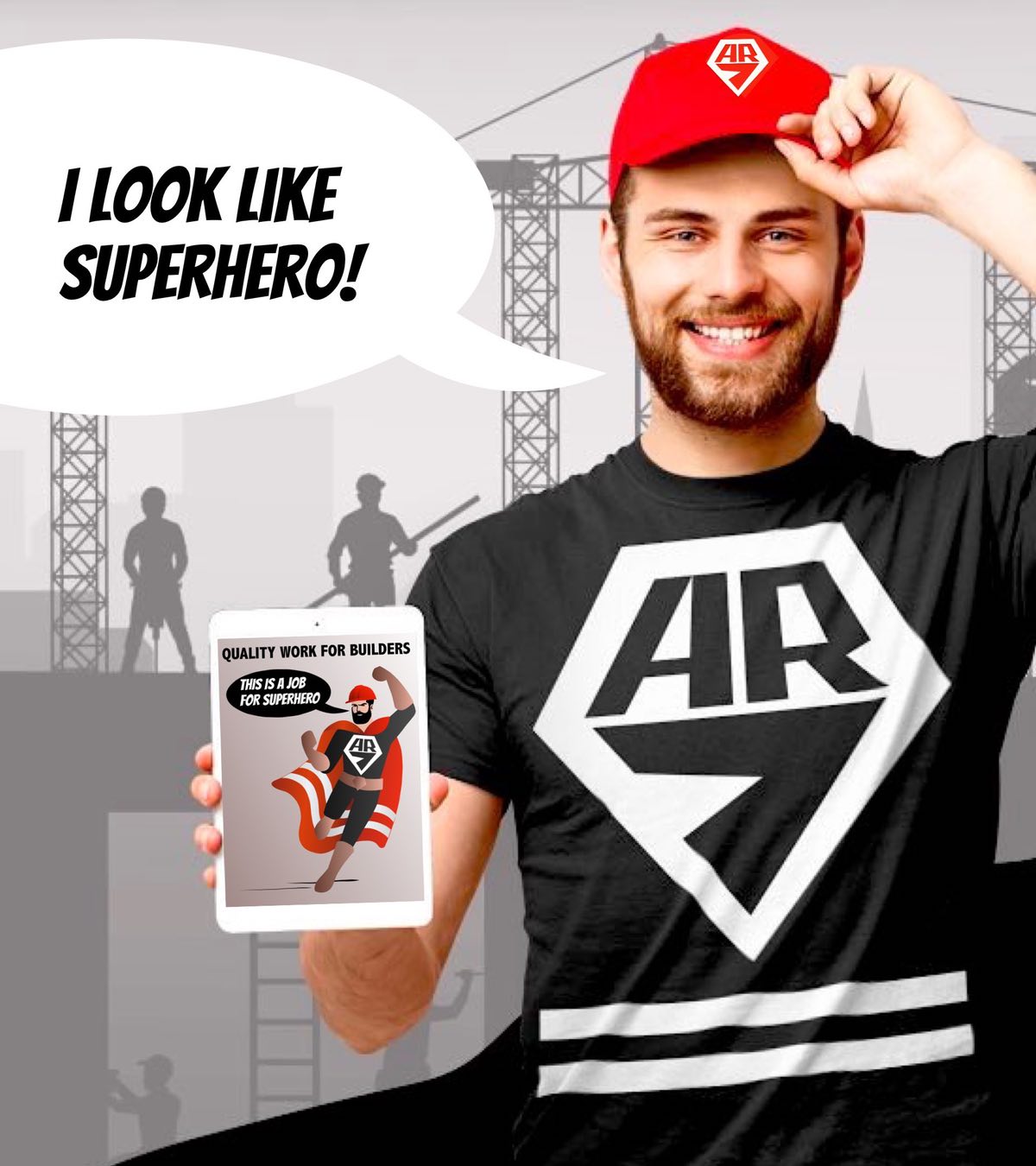

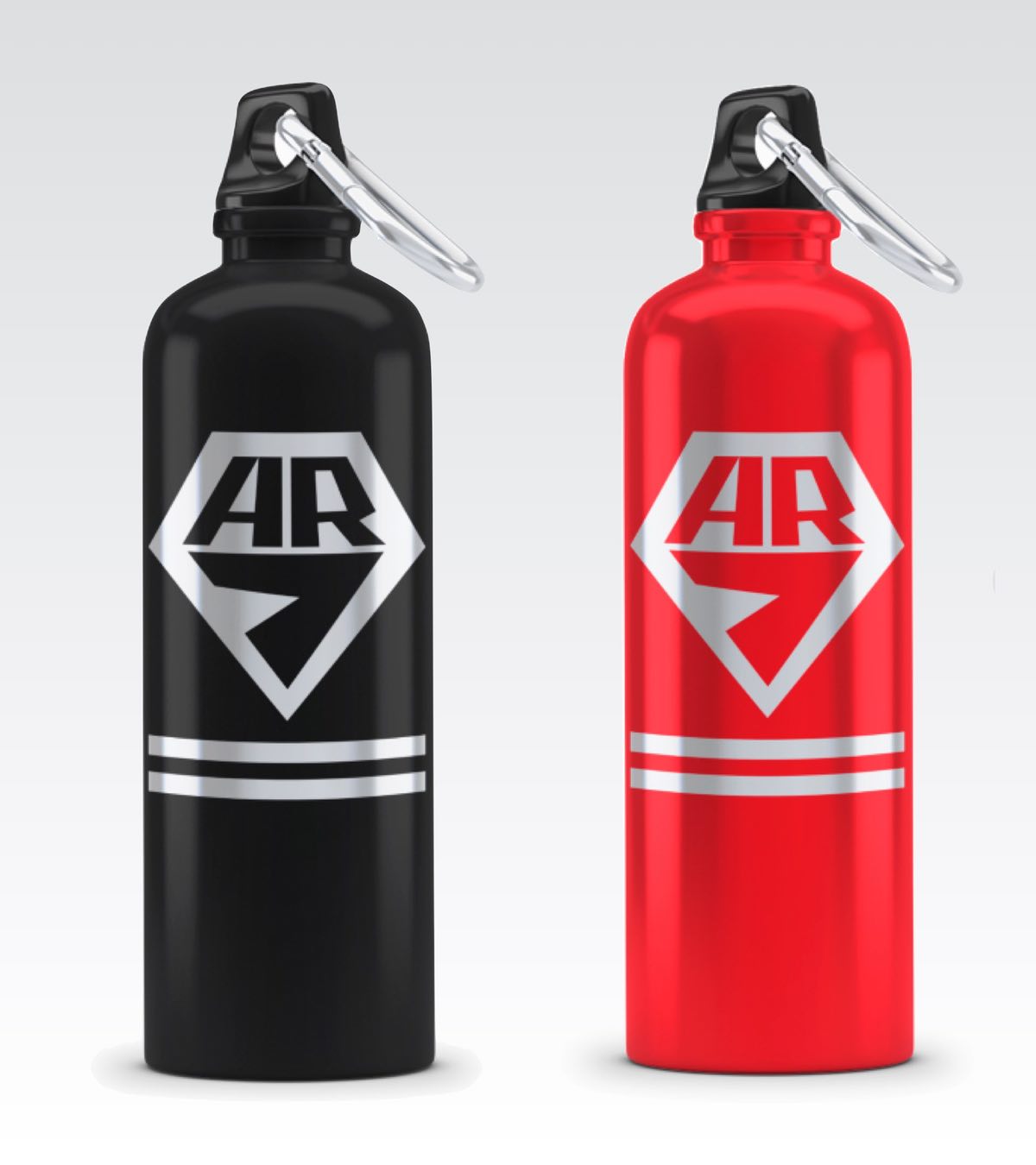
The emblem is applied to the clothing using reflective paint. In order for the emblem to be used on the red cap and clothing at the same time without creating a repetitive effect, the brand images had to be different. This is not an easy task when you only have one emblem. We found a simple and elegant solution that we are proud of. It is two stripes below the emblem on the garment. This is not just a decorative element to give the emblem visual stability, the two stripes symbolize the reflective elements of the famous yellow vest, which is used not only by protesters in France, but also by construction workers on all continents. In this way, an ordinary T-shirt with the logo becomes a construction worker's garment with a signaling function. We added the same two stripes to the cape of our superhero builder. The result is an original, recognizable and easy to remember visual image. Now an AR7 employee will look like both a superhero and a builder, and our superhero will look like a superhero-builder. The circle is closed by two symbolic stripes.
And that's not all the connections we've created between the employee and the superhero. The advertising slogan "We work like superheroes" and the illustrated explanatory text we wrote for AR7 created an additional mental connection between them.


Conclusion
Conclusion
View our case studies to get a picture of working with Nardans.
We are grateful for the cooperation and positive relationship we have developed with AR7
Conclusion

Conclusion
We are grateful for the cooperation and positive relationship we have developed with HR7
Conclusion
We are grateful for the cooperation and positive relationship we have developed with HR7


-
Can I see through the client's eyes or do I need help?
Depends on the product. If your product is on the shelf of a supermarket or online store, it will be easy for you to understand how it looks to the consumer. On the shelf, your product is surrounded by competitors and you can easily understand how good your brand is. But in real life, a great many goods and services are never sold in supermarkets or online stores. Your product itself could be a supermarket after all. What to do in this case? In addition to what we have already talked about regarding the consumer's reverse point of view of your brand, it is not enough for you to simply go ashore and look at your brand ship from the outside. You need to see yourself next to your competitors. Just as a consumer does when comparing alternatives before making a choice. Only then will you look at your brand through the eyes of a client. We will arrange this for you. We always make competitive comparisons of brands for ourselves in order to achieve better results. Our clients also get this opportunity to first see what they have, and in the end evaluate what we have actually done for them.
Depends on the product. If your product is on the shelf of a supermarket or online store, it will be easy for you to understand how it looks to the consumer. On the shelf, your product is surrounded by competitors and you can easily understand how good your brand is. But in real life, a great many goods and services are never sold in supermarkets or online stores. Your product itself could be a supermarket after all. What to do in this case? In addition to what we have already talked about regarding the consumer's reverse point of view of your brand, it is not enough for you to simply go ashore and look at your brand ship from the outside. You need to see yourself next to your competitors. Just as a consumer does when comparing alternatives before making a choice. Only then will you look at your brand through the eyes of a client. We will arrange this for you. We always make competitive comparisons of brands for ourselves in order to achieve better results. Our clients also get this opportunity to first see what they have, and in the end evaluate what we have actually done for them.
-
Can you create a better-look image with an old logo?
Yes, we love doing this. We call it the Nardans Look. We have many interesting examples of such work, which we will demonstrate when you contact us.
Yes, we love doing this. We call it the Nardans Look. We have many interesting examples of such work, which we will demonstrate when you contact us.
-
Can you work with a short turnaround time?
We are convinced that ideas must mature. Creativity is something you can't speed up. That's why we cook it over low heat. It tastes better this way.
We are convinced that ideas must mature. Creativity is something you can't speed up. That's why we cook it over low heat. It tastes better this way.
-
How long does your Logo Design process usually take?
Two weeks. 14 days. But we only charge you for 7 days -)
Two weeks. 14 days. But we only charge you for 7 days -)
-
What is your main advantage?
As you can see on our sign, Nardans is a branding design from marketers. First of all for business. It's not because we like big-money customers, everyone likes them. This means that we offer you not only design, but also our expertise in marketing. Our first-class marketing expertise is our greatest asset.
As you can see on our sign, Nardans is a branding design from marketers. First of all for business. It's not because we like big-money customers, everyone likes them. This means that we offer you not only design, but also our expertise in marketing. Our first-class marketing expertise is our greatest asset.
-
What is the main brand element?
It all depends on what point of view you look at the brand from. From the customer's point of view, this is the image of the product. No matter what your clients tell you, this is what they pay for. Modern marketing is packaging marketing, even when it comes to such invisible products as services. From a business point of view, the main element of a brand is the name. The name is long-lived. A name often lasts longer than a logo or website and much longer than any advertising. Giving up a name is the hardest thing. Therefore, in our work we pay special attention to these two brand elements.
It all depends on what point of view you look at the brand from. From the customer's point of view, this is the image of the product. No matter what your clients tell you, this is what they pay for. Modern marketing is packaging marketing, even when it comes to such invisible products as services. From a business point of view, the main element of a brand is the name. The name is long-lived. A name often lasts longer than a logo or website and much longer than any advertising. Giving up a name is the hardest thing. Therefore, in our work we pay special attention to these two brand elements.
-
Why did you merge naming with graphic design?
It is no coincidence that we combined brand naming with graphic design. A brand name, unlike a person’s name, is primarily a visual element. We learn about most products through visual advertising or packaging, whereas more often we meet people or learn about them through conversation. Well, before Tinder, it was probably exactly like that. Therefore, we consider the situation in which some come up with a name, while others visualize it, not optimal. The name may sound amazing, like the name of the author of The Little Prince, but Antoine de Saint Exupéry is very difficult to visualize. In addition, we own naming technology, the existence of which the uninitiated do not even suspect. Therefore, if you already have a wonderful name, move on, but if you need it, contact us.
It is no coincidence that we combined brand naming with graphic design. A brand name, unlike a person’s name, is primarily a visual element. We learn about most products through visual advertising or packaging, whereas more often we meet people or learn about them through conversation. Well, before Tinder, it was probably exactly like that. Therefore, we consider the situation in which some come up with a name, while others visualize it, not optimal. The name may sound amazing, like the name of the author of The Little Prince, but Antoine de Saint Exupéry is very difficult to visualize. In addition, we own naming technology, the existence of which the uninitiated do not even suspect. Therefore, if you already have a wonderful name, move on, but if you need it, contact us.
-
Can I order separate services or only the Branding Pack?
You can order any service from our list separately, or even something individually. This will be a justified choice in two cases. If you are not yet our client and want to start small, or if you already have our Branding Pack, but need additional services. If you are on the threshold of a new cycle of your development and are ready to trust us, then choose Branding Pack. Whether it's launching a new business, a growth program or expansion into new markets, in any case, you are going where you haven't been before. Even if your brand as a whole is already formed and there are no apparent reasons to change anything, it won’t hurt to look at yourself “in the mirror” and prettify yourself.
You can order any service from our list separately, or even something individually. This will be a justified choice in two cases. If you are not yet our client and want to start small, or if you already have our Branding Pack, but need additional services. If you are on the threshold of a new cycle of your development and are ready to trust us, then choose Branding Pack. Whether it's launching a new business, a growth program or expansion into new markets, in any case, you are going where you haven't been before. Even if your brand as a whole is already formed and there are no apparent reasons to change anything, it won’t hurt to look at yourself “in the mirror” and prettify yourself.
-
What are your terms and conditions?
We have only one condition - your product must be truly high-quality and useful, because we do not deal in nonsense. Jack Trout in his book Positioning wrote that the product has become less important, and what matters is what the consumer thinks about it. We disagree with Trout. This is an unreliable strategy. The client pays the price for the product, and not for his thoughts about it. If he is disappointed in the product, his thoughts will quickly change and all investments in phony brand positioning will be lost. We are sure that the product, its value and price are the basis of branding, and design is only a facade. This is exactly what we do. We do not believe in a strong brand for a bad product with an unfair price and do not undertake such work.
We have only one condition - your product must be truly high-quality and useful, because we do not deal in nonsense. Jack Trout in his book Positioning wrote that the product has become less important, and what matters is what the consumer thinks about it. We disagree with Trout. This is an unreliable strategy. The client pays the price for the product, and not for his thoughts about it. If he is disappointed in the product, his thoughts will quickly change and all investments in phony brand positioning will be lost. We are sure that the product, its value and price are the basis of branding, and design is only a facade. This is exactly what we do. We do not believe in a strong brand for a bad product with an unfair price and do not undertake such work.
-
What are your average rates and project duration?
Our most common daily rate range is typically $200-$500 per day depending on the complexity and length of the project. The rates and duration of the project are finalized after discussion and clarification of all details.
Our most common daily rate range is typically $200-$500 per day depending on the complexity and length of the project. The rates and duration of the project are finalized after discussion and clarification of all details.
-
Where should I start?
To simplify the interaction, we do not suggest filling out large forms from the very beginning with complex questions, the answers to which may take a long time and will not be useful in a particular situation. Just below you will see a simple form in which you can write without any preparation how we can help you. We will ask you all the necessary questions, provide the necessary information, and prepare proposals.
To simplify the interaction, we do not suggest filling out large forms from the very beginning with complex questions, the answers to which may take a long time and will not be useful in a particular situation. Just below you will see a simple form in which you can write without any preparation how we can help you. We will ask you all the necessary questions, provide the necessary information, and prepare proposals.



Like what you see?


Like what you see?
Like what you see?
Like what you see?


Please email us using the request form below - we will contact you as soon as we can.
Please email us using the request form below - we will contact you as soon as we can.
Please email us using the request form below - we will contact you as soon as we can.
The Team


⎈
If you see this message, it means you are viewing our condensed version of a full desktop site


